CRIF: UI/UX design and front-end layer
The system enables collecting and processing information about business contractors in the fintech space.


The Client
CRIF is a global fintech company/credit bureau specializing in business information, outsourcing and processing services, and credit solutions. They offer a wide range of tools and services related, among others, to credit risk assessment, credibility, ratings, decision-making process, credit collection, or business process optimization for lenders, banks, companies and customers. One of the key solutions is an online system, which allows for collecting and processing information about contractors, required some changes.
CRIF
FromItaly

Challenge
One of the key solutions provided by CRIF is an online system that enables collecting and processing information about contractors. The system has been running for over ten years, and it required some changes. The primary goal was to update the tech stack to meet today’s standards and adjust the user interface design to increase displayed data’s readability. Client resources included back-end layer API. Our work scope included the new UI/UX design and the front-end layer development and implementation.
The system has been running for over ten years, and it required some changes. The primary goal was to update the tech stack to meet today’s standards and adjust the user interface design to increase displayed data’s readability.

Our solutions
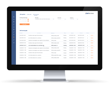
Following the client’s requirements, our designers have prepared a new, intuitive, user-oriented interface project. The new, clear way of presenting data allows users to find the most relevant information and compare them with other database records faster and easier, which significantly affects their work’s comfort. Custom designed icons and minimalistic elements matching the corporate identity standards make the interface look modern and unique. Our web developers team has been responsible for new design implementation and creating a front-end layer from scratch. Together with developers working on the client’s side, we decided to choose a tech stack that will ensure high performance (necessary when working on a large amount of data provided by API) and possibly develop. The Front-end layer is based on React and Redux – libraries that are great for websites containing a lot of data changing over time. We have chosen a styled-components framework for creating a lightweight, responsive user interface and Cypress for running detailed browser tests. For testing & development, we also used a mock-API built on JSON Server. Technology stack:
- React
- Redux
- Webpack
- Styled components
- Cypress
- JSON Server
The results
Within three months, our team completed all assumptions defined by CRIF, through design new, intuitive user interface and lightning-fast front-end layer implementation. Proper project analysis, suitable tech stack choice, and transparent communication were crucial for this project’s success.

Technologies we used
Find us on Clutch
Take a look at our profile on the world’s largest B2B reviews site, Clutch,
to see what others are saying about us and how we work.
Let’s chat!
 Hi, I’m Marcin, COO of Applandeo
Are you looking for a tech partner? Searching for a new job? Or do you simply have any feedback that you’d like to share with our team? Whatever brings you to us, we’ll do our best to help you. Don’t hesitate and drop us a message!
Drop a message