Top Tips for UX Design in Your App
Good UX is essential for any successful application. Here are some UX tips and tricks to remember when you’re developing your custom app.

Good UX is essential for any successful application. Here are some UX tips and tricks to remember when you’re developing your custom app.
User experience design means different things to different people. But at its core, it’s a set of best practices you should follow to make our app the best it can be. As in any design challenge, UX design takes the needs and expectations of users and incorporates those into a working product.
If you’ve ever been frustrated by an application, whether it was hard to read or impossible to navigate, you’ve run into a project that failed to take UX fundamentals into consideration. Either there was no UX designer on the project or design recommendations went ignored.
I don’t know if you’ve noticed, but people are impatient and increasingly distracted — especially on their mobile devices. Even minor frustrations can make users bounce.
Successful companies make UX a priority. Think Google, Airbnb and Slack. Each took very complicated design challenges and presented them in simple, straightforward ways. Users want the app to work intuitively and to look nice. For that, you need to follow some Current UX tips and tricks.
Here are some tips for UX design to use as you’re developing your own application.
Before you start any development, it’s a good idea to clarify all your goals for the app. Who it’s for, what you want it to do and how you want it to look are all things your developers and designers need to know.
In industry jargon, this is often called product discovery and it’s essential to have good UX in the final product. Product discovery phases help uncover functions that are necessary and those that are not. Obviously, don’t include unnecessary functions.
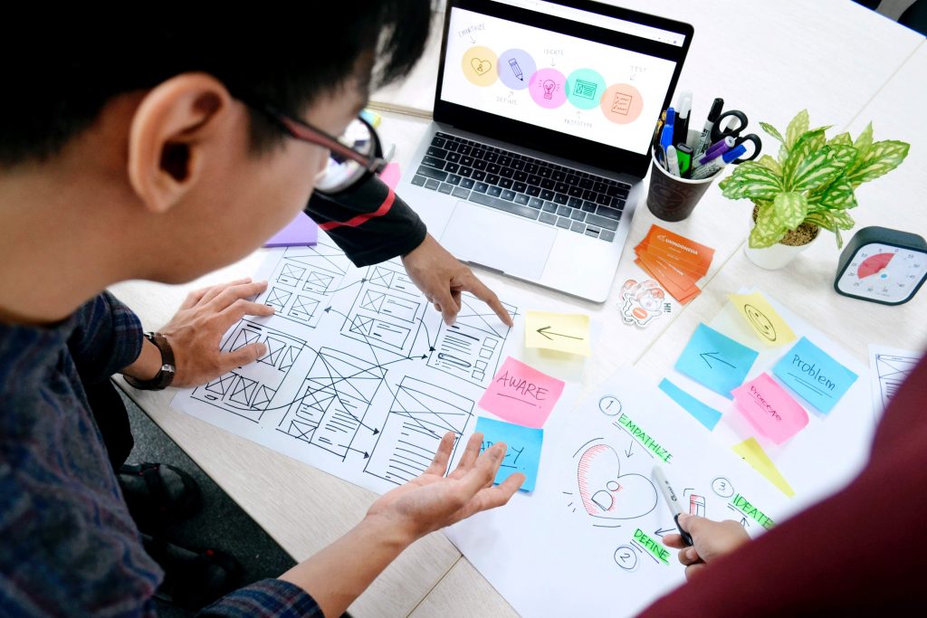
Instead, create low-fidelity prototypes and use them to test flows with real users. Then start UI design when the test phase is complete.

If you’ve already designed interfaces before testing flows with users, they may not understand it. It can lead to wasted time if you have to go back and adjust the UI to make it clearer.
The main point here is to design and test flows with real users. Gut feelings or top-down directions about how users behave rarely reflect reality. Creators shouldn’t guess how end-users will behave or what operating system they’re used to.
One example is a designer might put an action button in the top bar — logical choice. However, Android users have floating action buttons on their devices. A button in the top bar on an Android app can increase the time it takes users to find the button and they could bounce in frustration.
These revelations often emerge in a testing phase, and you can adjust the flow easily if you’re still working with a prototype.
Web content accessibility guidelines inform a lot of design choices. Many of the guidelines are good for everyone, not just people with disabilities. Clear design, options to change the color or contrast and overall less busy layouts improve everyone’s web experience.
From a UX perspective, making sure that elements are easy to navigate is one of many considerations to include. Make sure to test the app with a system bar or navigation bar applied so that your elements are not covered up in the safe areas.
Again even slight frustrations can drive users away. If part of your app is unusable for some people, they’ll use competing apps that are easier to navigate.
For more tips on how to make your app more accessible, go to our article dedicated to this topic.
One of the great things about design is it forces you to think of other people’s experiences. What you find intuitive may not be intuitive for someone else. This is why testing is so important as it uncovers weak elements of a design that you can then fix.

That said, there are some basic usability guidelines to follow. For mobile, for example, you should design apps for users to navigate one-handed, or for use in bright sunlight. Making buttons big enough to tap and far enough apart are key UX fundamentals. Making it easy to change settings and reach elements makes user experience so much nicer.
Less friction means lower bounce rates. Keeping users on the app and coming back should be your top priority.
Follow tried-and-true patterns for the many actions your users are familiar with. Logos in the top of the page should direct you to a homepage when you click. Three dots in the header should lead you to more options.
We take many of these common actions for granted as we navigate our web and mobile apps, but if you ever try to use one where the button you expect is not where you expect it, it can be frustrating.
Your users should not have to work too hard to learn how to use your app — because they won’t.
Sticking to clean, minimal designs is one of the best tips for UX design if you want your application to be successful.
Don’t transition web designs straight into mobile. Mobile designs lack some desktop app functions or interactions such as hovers, which are the little boxes of additional information that pop up when you hover over a line of text on a web page. Of course, you can’t have this feature on mobile, so you’ll need different design solutions.

Also keep mobile operation systems rules and mobile users’ habits in mind. You can also use gestures and typical interactions for Android or iOS.
Some of these include swiping right and left, scrolling up and down, enlarging a view with screen pinching, or double-tap. Dragging a list item right to remove it or unhide additional options.
There’s nothing worse than watching that loading icon going around and around. Did it work? Do I need to cancel and do it over again? This kind of uncertainty is not ideal and is something you should aim to avoid. If you don’t use any other UX tips and tricks, don’t forget this one.
Provide a timely response from the system – don’t keep users confused, don’t make them hesitate, always inform them what is happening behind the scenes. This is especially important in some industries.
Your banking app, for example, should not inspire anxiety. You want to be sure your payment went through and your money is safe. Any apps that deal with large purchases should be similarly clear about what’s coming next.
Reassure users with loading screens or progress bars. Skeleton loaders are also popular choices at the moment and tend to be better received than progress bars. But don’t be too serious. Cute animations are also a nice touch if it fits your brand voice or resonates with your target market.
Many users prefer the dark modes of web and mobile apps and want to toggle between them. This is mostly to delay eye strain, but can also help people with visual disabilities see the content better. As you’re designing your app, check to be sure that the color palette works for both light and dark modes.

This also goes back to usability fundamentals. You may need to adjust your colors to set the right contrast and legibility. Black and white are fairly straightforward to fix, but if your brand is more colorful, you could have your work cut out. So don’t forget to test how your dark mode looks.
With these tips for UX design in mind, you should build a great application that users will love. If something is not working, test out different flows and adjust accordingly. It’s important not to skip a thorough design audit and to take the advice of your designers. Testing with real users — and not relying on intuition is also a key takeaway from this.
Creating clear, accessible designs in your app development project will set you off on a good start. As long as the app’s intent is clear and users have tested the flows, it will be a great success.
 Hi, I’m Marcin, COO of Applandeo
Are you looking for a tech partner? Searching for a new job? Or do you simply have any feedback that you'd like to share with our team? Whatever brings you to us, we'll do our best to help you. Don't hesitate and drop us a message!
Drop a message