How to promote mobile app: Prerelease Buzz
Did you finish your mobile app? Nicely done, but before you submit it to the app store, you should generate a prerelease buzz.

Did you finish your mobile app? Nicely done, but before you submit it to the app store, you should generate a prerelease buzz.
Have you finished your mobile app? Nicely done, but before you submit it to any store, you have to generate prerelease buzz. Having a well-running application it’s just a 1/3 of way to make it succeed. Another 1/3 is promoting. The 1/3 and most important is a buzz. If you didn’t build an engaged audience before launch and your mobile app is now submitted then well…you blew it! Put your hope in viral marketing and count on a miracle. I’ll show you how to avoid it and make a good prerelease campaign.
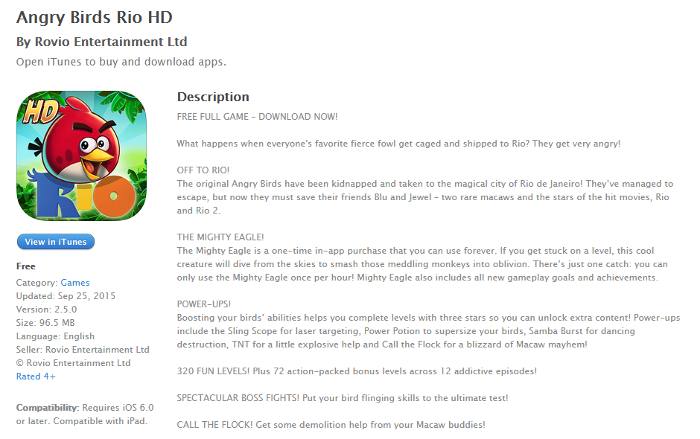
What would be the application without a logo? Or selected colours that are the basis for the creation of promotional materials and branding? Moreover, you recently create idea for your app. All the elements are the essence of the brand with users will identify. Don’t forget about storytelling while creating descriptions. People love to listen to great and memorable stories. Angry Birds Rio by Rovio is a good example.
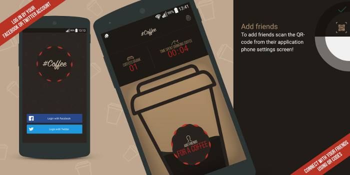
What you need is to prepare identity and promotional materials. While creating a logo and app icon you (or your Graphic Designer) should base on good design practices. I recommend you Logo Design Workbook to get some knowledge before you’ll start design. Icon and logo for you app should be scalable in the vector file with transparent background. This allows you to export it to different types of files in various sizes. As a result, designing multimedia and advertising materials will be much simpler. Mockups and screenshots visualize the appearance of the mobile app. You can just use screens or design presentation with features and a short tutorial. Take a look at how I did it with #Coffee.
Banners will be useful for Google Play or App Store review and also for all marketing activities. Think about some catchy slogan that describes your app and use it on the banner. Don’t forget that the easiest way to reach users is shortness and simplicity (KISS). There’s nothing more short and simple as a video trailer. It’s the best trick to show the advantages of your app and present how to use it „step by step”.
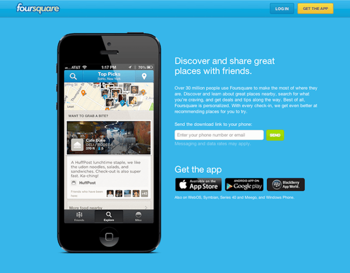
Ok, we have prepared everything that we need to move on and start buzzing. The next step is to set up a landing page, which will be connected with all pre-releasing actions. How landing page should look like? Should guide the user from the essential description, through the mockups, to the application store by using buttons. But for now, we have to replace download buttons with a counter which measure the time until the release. A landing page is also a perfect place to collect email addresses. Having them you can build tension by sending messages about progress and expected release. Remember to Keep it Short and Simple (KISS) and do it like for example, Foursquare did.
You can buy a page theme for your landing or use ready solution for an easy design like Launchrock.
You need to have a place to communicate with users of your app. Before you start talking with them about functionality/bugs/opinions you need to engage an audience. The group of people will eagerly wait for the big release. For this purpose, social media are most suitable. Facebook, Twitter, Google+ or another social media channel? It depends on who are your future users and what kind of social media they use the most. If you choose the most suitable channels you have plenty of options for building engagement:
Great job @MichaelKors leveraging the “like” w/ #InstaKors. One step closer to 1-click shopping on @Instagram. pic.twitter.com/b284qMenFy
— Jennifer Nguyen (@jennifereal) grudzień 19, 2014
Aside from social media, there are many opportunities to connect with future users. One of them is Preapps. It’s a community of people who are looking for new app ideas before launch. They can become your beta testers. By submitting an app you can collect your beta testers email and get valuable feedback. If you fill the information about expected release date then Pre apps display your app in section „Coming Out This Week” when the time comes. Simple and effective.
What can encourage users to use your mobile app? Trust! How to gain their trust? Just get some reviews from websites, social media channels or bloggers. People will be more inclined to download an app, which has been assessed by someone whom they trust. On the other hand, you can launch a blog on your landing page and start to create content. This solution has many advantages. Firstly, valuable content has an impact on SEO and increase site position in search results. Secondly, you have something extra to share with your users in social media and newsletters. Thirdly, users can share your content and help you in making buzz. Both solutions can generate high traffic on your landing page.
All activities connected with prelease buzz campaign should be integrated. If you create great content and you’re going to send a newsletter with it, let users know about it in social media. If you decided to create a unique hashtag for your campaign, use that hashtag at every turn. It can be a mail, post on social media, review on blogger site, promotional banner or infographic etc. Remember that reviews can generate valuable referral and social traffic. A blog post can generate tones of organic, social and referral traffic. Everything is possible thanks to the integration and wise planning.
 Hi, I’m Marcin, COO of Applandeo
Are you looking for a tech partner? Searching for a new job? Or do you simply have any feedback that you'd like to share with our team? Whatever brings you to us, we'll do our best to help you. Don't hesitate and drop us a message!
Drop a message