
Better Leave Management with FreeQuest
Good mobile app development comes down to good UX. Leave tracking app FreeQuest elevates boring leave management with an engaging design.

Good mobile app development comes down to good UX. Leave tracking app FreeQuest elevates boring leave management with an engaging design.
Year-end holidays are notoriously hectic for any organization. Everyone has to finish up the year’s tasks and take off in time to get home in time for the holidays. The last thing you want is an ugly leave management system to add to the stress. With less than two months to go, it’s good to have a system in place.
As you’re planning your vacation, you want a user-friendly tool to get you excited to get home to your family. For this, we’ve developed FreeQuest. It’s our in-house mobile app development project now used by thousands across the world.
It all started in 2015 when our team found a lack of leave tracking tools on the market, especially one with a mobile version. Many of the existing apps didn’t fully meet our team’s needs, so we made one ourselves. From the beginning, sleek design and intuitive UX were top priorities.
Like all apps, putting real people first is fundamental to our design practice. Through the years, we’ve tracked app analytics and listened to feedback, and have implemented changes to improve FreeQuest. Here’s how it all started and how we’ve carried out our internal mobile app development project.
Nearly seven years ago, our process for leave tracking was cumbersome. Applandeo was growing rapidly, and with every new employee, their leave tracking only got more complex. Add the intricacies of Polish labor law (we’re based in Kraków) into the mix, and we not only had an organizational obligation to streamline, but we also had a legal one too.
Public holidays, sick days, paid time off as well as maternity and paternity leave are some of the many categories of leave employees working in Poland are entitled to. All these separate pools of allowances quickly became a nightmare to keep track of manually as our team grew.
At first, we started searching for existing tools that would help streamline our HR systems. None really fit. Most were web apps only or were so overly complicated that they only made more problems than they solved. Other apps were simply unappealing and did not inspire the good-mood vibe we thought you should have as you’re planning a vacation.
And then we thought — wait a minute, we make mobile apps for a living. So the idea was born. We’d just have to make an effective leave management system ourselves.
From the beginning, the goal was to create a mobile-first app that handles leave requests in the simplest way. It had to be both robust enough to scale, but also keep a relaxed and friendly tone, not a dismal corporate slog.
Similar to Applandeo’s brand voice, FreeQuest had to reflect our own friendly, but knowledgeable approach. Since it was initially an internal project, FreeQuest had to play a role in keeping morale high in a growing team. Part of that was not making it too corporate.
From a UX perspective, “not corporate” meant incorporating bright colors, animations, and micro-interactions into the app’s components. Selecting days off and viewing your time off allowances had to be intuitive for employees. Notifications and approvals also had to be clear and easy to navigate.
Goal setting and laying out a list of backlog items was the easy part. We had our work cut out for development.
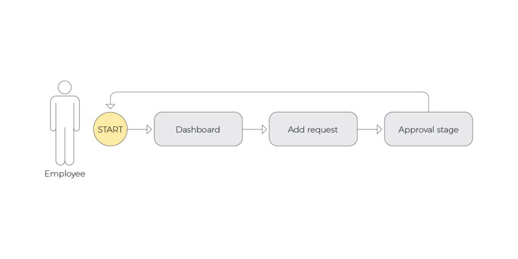
Since the goal of FreeQuest was design-first, the first step was to begin prototyping user flows. To conceptualize a user story, we created these UX user-flows below. Any leave tracking requests would have to go through a manager, so there were two main roles you could be as a user — A manager or an employee.
Each role has a unique navigation path. For employees, navigation is straightforward. You have a dashboard to add a time off request and a counter that displays your category of leave. Once you add dates and submit, the request goes to a manager, who then approves or denies the request.
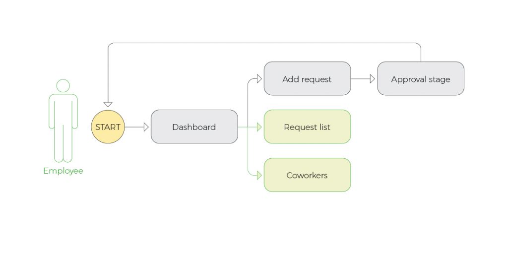
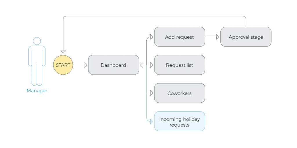
Managers, meanwhile, have a higher-level view of the teams they oversee. They have more options and screens to see who has requested what time off. All these features are customizable, and you can invite, remove or update user permissions.
Throughout its lifetime FreeQuest has gone through several iterations. Each has evolved as we received user feedback and examined how users interact with it. In its current form, there are two versions for iOS and Android. On top of the two mobile versions, we developed an admin panel with React on the front end and Node.js on the back end.
One suggested feature we got early on was the inclusion of a remote working option. Part of why that was useful to us as an organization is that coworkers and managers can also see who’s working remotely or out of office and unavailable. For organizations that are considering hybrid work models now where employees have to be in some days but not all, this feature is both useful and trendy at the moment.
In later iterations, our developers added reporting features so HR departments could print out an annual report on days worked versus days off to keep us in line with the law.
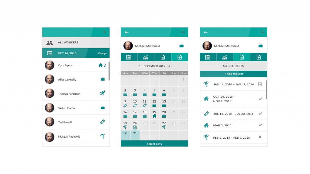
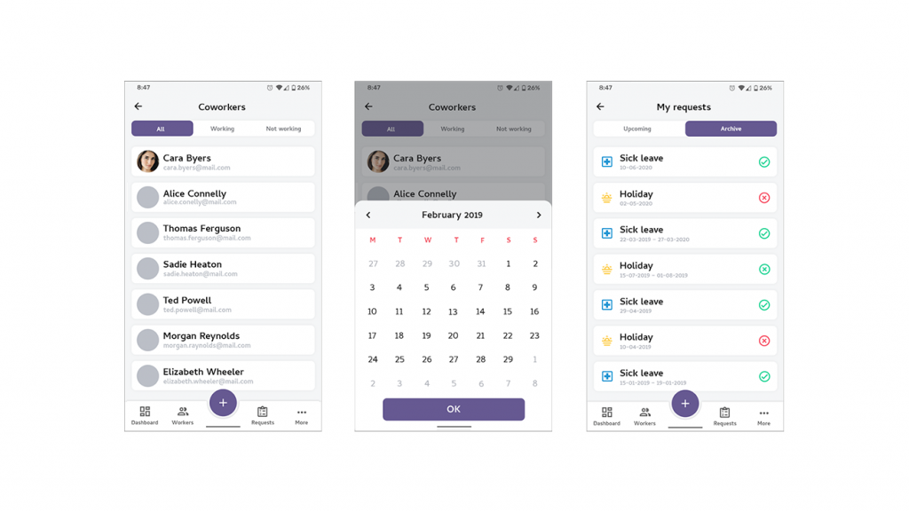
Way back in 2015, the first iteration featured a clean interface that was easy to navigate and choose the type of leave with descriptive, intuitive icons.
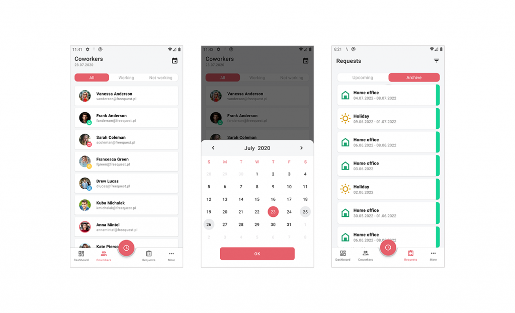
Our next big iteration came in 2019 with an overhaul of the UX in response to the release of Google’s Material Design. In addition to a much-needed visual update, the new version incorporated some of the design principles like micro-interactions shadows and padding around elements. Most of the harsh angular corners on the elements got rounded off to give them a softer appearance.
In 2020 as we all had to work from home, it was a perfect time for another update. This version further softened the elements and made it easier to request home office days.
Once we had mockups ready to show, our team started the testing phase. From the beginning reception was positive. Many of the first pieces of feedback praised the bright colors and intuitive UX for making users feel excited to take time off. Using a sleek app, especially one developed internally, was also a huge morale boost for developers themselves.
With any mobile app development project, there’s also a lot of feedback and suggestions about how to improve. It’s vital to test an app on a diverse set of people as well as elicit feedback. What was initially an app to request time off quickly morphed into a full leave management system.
Several early suggestions, as I mentioned, wanted an option to track remote work. Before the pandemic, it was typical for software houses to give allowances for home office days as part of a benefits package. Now, of course, these remote working days are standard and often unlimited.
Many organizations still want to track days employees are out or to simply know where your employees are working any given day. It saves some back and forth on Slack or email.
Another suggestion we implemented was the option to carry over any unused days of leave to the next year. In some countries, including Poland, paid time off is required as part of your salary and those days don’t expire. Depending on where you are in the world, you can personalize the app. When you set up an account, you can choose a calendar that includes your country’s public holidays and also add in any other days off your organization observes.
Add in PTO and sick day allowances as well as any other types of leave your company offers.
Some HR professionals wanted the option to create a report of days worked and days off for each employee for both organizational and legal reasons.
All kinds of app development projects go in stages, each one improving the last version. Right now, our developers are working on a web version to make FreeQuest more accessible to administrators. Several of the new functionalities make leave types more customizable. For example, we’re working on a feature that allows you to choose “leave on demand,” which comes out of your PTO days but does not carry over to the next year.
As always, we’re also continuing to collect analytics data from a growing pool of users to make changes. Often direct feedback or requests for specific features are only part of the wider story. Taking both change requests and actual user data into account is a vital part of UX design.
Either way, we’re excited to continue to develop FreeQuest and constantly improve it for organizations to handle their leave management.
As organizations grow, their leave tracking gets more complex. That’s exactly where we found ourselves when we began creating FreeQuest, our once internal, now fully launched mobile leave tracking app.
Simple UI design and inviting UX have gone a long way to making FreeQuest the useful app it is today. It’s not only intuitive, but it also puts users in the mood to go on holiday and recharge. It gives managers and HR professionals powerful insight into who’s off and when they’ll be back. The app also ensures that people are taking the days off the law requires.
Try FreeQuest to handle your organization’s leave management. If you’ve got an idea for a different app, we’d love to talk. Feel free to contact us!
 Hi, I’m Marcin, COO of Applandeo
Are you looking for a tech partner? Searching for a new job? Or do you simply have any feedback that you'd like to share with our team? Whatever brings you to us, we'll do our best to help you. Don't hesitate and drop us a message!
Drop a message