 - AdobeStock_368255380-scaled")
10 UX Design Fails to Learn From (and Avoid)
Check out these bad UX design examples, learn why they don't work and what you can do better. Practical tips on UX best practices guaranteed.
Check out these bad UX design examples, learn why they don't work and what you can do better. Practical tips on UX best practices guaranteed.
Invisible design is one of the critical elements for user experience in website and app development. The core idea is to make the process of using an online service or website as smooth and intuitive as possible so that the user doesn’t even notice the designer’s work but simply interacts with it in a natural way.
Unfortunately, not all online companies adhere to this practice. When used right, it provides ease of use and an improved user experience so that people return to an app or website again and again. Even 88% of consumers never return to a site if they think it has a poor design. The truth is hard, and these kinds of mistakes happen even to experienced companies. If you want to avoid these gaffes on your website while increasing user engagement and conversion rates, be prepared for our top picks of UX design mistakes to watch out for.
In this article, we will present you with examples of bad UX design and complement them with advice on an effective UX for modern businesses. Read on if you want to learn more about why UX design is so important for online services and apps.
Like any digital product, the way you design an online business lays the foundation for success. It determines a user’s first impression and can greatly influence their satisfaction with the service. In addition, the design of UX also conditions a customer’s willingness to either return to a site and buy something or immediately bounce out if the buying process is too complicated or pop-up features are distracting. Company reputation, sales, attracting new customers or losing them all depend on the right UX design. Here are three key benefits of a well-maintained UX of your website or app:
A good UX design should be aesthetically pleasing and well-planned in terms of colors, usability of features, product navigation, and overall service. It is especially important for startups that don’t yet have a strong brand image or a wide reach — in their case, a practical, easy-to-navigate, and user-friendly website is a milestone for building a growing customer base.
Why do some organizations fail to do this? The sad news is that flawed UX design usually results from isolating the UX processes of development and production. UX Designers should collaborate with developers, graphics artists, and marketing departments from the beginning. Another difficulty arises from team leaders who do not understand the vision of the project or managers who cannot communicate well. A strong and competent UX team that works on par with the programmers and, above all, is taken seriously is a must if you want to avoid a UX design that scares away customers.
Having discussed the significance of a well-executed UX design to the success of your business, let us now turn to some surprising cases of poor UX. The following ten examples of failed user experience design highlight typical mistakes you should be aware of. Surprisingly, some of these mistakes that don’t seem problematic at first glance can have devastating consequences.
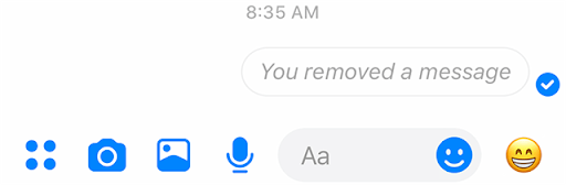
We’ll start with a dread-inducing scenario — sending the wrong message to the wrong recipient on WhatsApp or Messenger and then panicking and trying to delete it before they see it. Sound familiar? We’ve all been there.
Unfortunately, that’s where UX comes in — even if you manage to delete the private content, the recipient may see a notification that a text or message has been deleted. This is a glaring example of the failure of UX, which makes the process unpleasant for both parties — the sender, who did not want to share anything in the first place, and the recipient, who ends up getting a notification anyway.
Welcome to one of the most unpleasant and disruptive features of Netflix — autoplay. What do we mean by that? When you click on the thumbnail of a movie or show to get more information about it, the app automatically blasts a loud trailer. The core problem is the automatic nature of this option — a feature that involves a sudden, unprompted noise should not be standard under any circumstances.
It’s distracting, exhausting, and discourages further use. Moreover, it is not easy to disable this feature and mute all preview videos. Such a design of UX should not be used if it affects the overall usability of the website or prevents visitors from quickly accessing the desired information.
The hamburger icon is a navigation component that is common in some mobile apps and websites. By clicking on the three horizontal lines that make up this icon, you can scroll through an app and access its main features.
Among the many websites that have opted for the hamburger menu are Google, Amazon and YouTube. The biggest drawback is that it is not intuitive and hard to learn, which discourages users from using it. Hamburger menus reduce interest, devalue features, and make it difficult to find the alternatives they want. More importantly, they can downright confuse consumers.
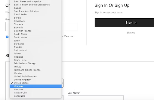
You’ve probably had the unpleasant experience of having to select your country, year of birth, or other dates from a seemingly endless dropdown menu. This is impractical, bothersome and makes a person less likely to stay on the site to fill out a form or make a purchase.
Long dropdown menus without filters or subsections take up a lot of valuable time, which can be a deciding factor in some situations.
We are bombarded with content on every website. It’s no secret that it’s not easy for users to work their way through chunks of text or various menus. That’s why, in all circumstances, we should make sure that hyperlinks leading to core functions are visible.
If they are integrated into the text and not highlighted, no one will notice them. Links are important to help users navigate through a website. However, if they are hard to find, visitors will not click on them to explore the site further, and they’ll leave more quickly. To avoid your conversion rate dropping, remember to highlight all links.
Now we have reached the point of endless debate about the usefulness of popups. Although they provide relevant information to the user and very often contribute to higher conversion rates or signups for your newsletter, most people find them aggressive and unhelpful. Popups very often annoy potential customers who just want the window to go away and then leave your website altogether.
The damage is even greater if the button to exit the window is hidden or hard to see, which adds to the potential customer’s annoyance. Taking away the user’s autonomy and sense of control is certainly an example of poor and outdated UX design.
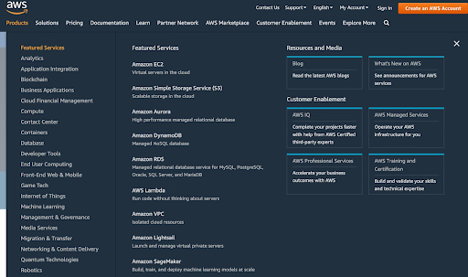
Another typical UX cliché that you should avoid at all costs is overcomplicating processes so that they are not usable or practical anymore. A good example of this is Amazon’s navigation system, which is anything but intuitive. Although AWS’s many features are visually inviting and clearly presented, the overwhelming number of options confuses users and prevents them from finding the information they need. As a result, the customer must spend more time navigating the services, leading to wasted time and frustration.
If you have ever tried to write a longer text in a single-line text box, you know what I am talking about. Since it does not expand into a multi-line input field, you do not end up seeing the entire message as you create it. This goes against the basic principles of UX and UI. It can lead to numerous errors and repetitions — or even to the user submitting a message before checking whether it makes any sense at all. This misguided feature is one of the most vexing UX faux pas that prevents people from fully using a particular platform, filling out a form, or writing a message.

Elements on mobile screens should have enough space for people to click around with their fingers without fumbling over other elements or clicking on the wrong buttons by mistake. This is both a UX problem and also an accessibility issue, but make sure your buttons have enough space for people to be able to easily navigate a user interface. Elements should not block other elements — this is especially true of popups or other interactive elements.
One notorious example is the navigation on Groups on the Facebook mobile app. The hamburger menu and the back button are too close to each other and can either confuse visitors or cause people to click back when they’re trying to navigate. Making sure a site’s navigation is vital to good UX.
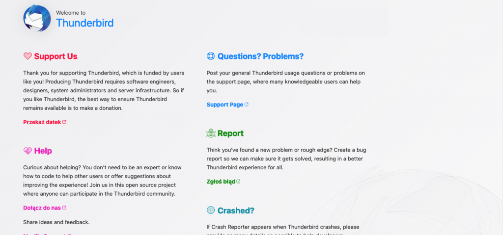
It should be immediately clear what any design elements in your user interface are. Vague or ambiguous elements can confuse users, causing them to bounce or have other unintended consequences. This is especially true on small screens where design elements are harder to distinguish from the background. One example of this is the open-source email client Thunderbird.
What’s clearly a sketch of a connected world on a large screen looks like a cracked screen or a finger smudge on a mobile. Of course, it’s easy to figure out your screen isn’t cracked, but such elements can give your brand negative associations.
Since you have seen the plethora of potential mistakes that can happen when designing UX for both small businesses and huge corporations, for dessert, we have three crucial tips to keep your website user-friendly and straightforward at the same time.
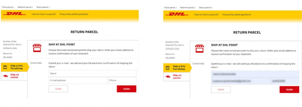
Make sure that the labels are visible when you design the space to enter values. Auto-fill occasionally provides incorrect information that is incompatible with the input data. Since there is no way to verify this if there are no labels over the input field, you should discuss this potential problem with the developers and designers in advance. You would not want customers to enter the wrong contact information for their order, would you?
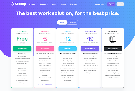
If you are willing to ensure a smooth user experience and the feeling of receiving solid and trustworthy information, use grouped titles, as shown on the ClickUp feature page below. They do a good job of presenting possible options for their services. Introducing an elegant background, typically a white tile with a delicate shadow underneath the content. Also, using proper font size and weight & smart white space usage is ideal for creating thematic groups. These help users find relevant data, see differences between the displayed prices, and understand the overall message.
As obvious as it seems, stick to the principles of UX best practices. Use headings and subheadings frequently to make the different sections of your text easier for your audience to identify and browse through. Remember to bold keywords, use H2 and H3 headings, and visually separate them from the text. If the user can quickly and fluidly skim through the content of your website, they are more likely to stay on it and search for data that is attractive and useful to them.
A good UX design is not always easy to achieve, but you should always strive to respect the core principles of UX and UI. If you do this and prioritize a natural, user-friendly, and uninterrupted experience, your users will not be confused or annoyed. Consider the user experience for the customer, think about the practical side of every visual element or button you implement, and make a positive user experience your primary goal
If you manage to avoid these mistakes and consider UX from the beginning of the development process, you should be on the right track.
 - marcel-100px") Hi, I’m Marcin, COO of Applandeo
Hi, I’m Marcin, COO of Applandeo
Are you looking for a tech partner? Searching for a new job? Or do you simply have any feedback that you'd like to share with our team? Whatever brings you to us, we'll do our best to help you. Don't hesitate and drop us a message!
Drop a message - Start-a-project")